Finding a beige that reads warm and clean without veering into pink, yellow, or drab gray can feel like an impossible mission. The wrong undertone can make an entire room feel dated or cold, and color matching from online swatches adds another layer of risk. This guide cuts through the uncertainty by focusing on pigment quality, finish, and real-world coverage for true beige paint.
I’m Min — the co-founder and writer behind Gadgets Feed. I’ve spent countless hours cross-referencing color codes, binder formulations, and customer coverage reports to isolate the paints that deliver a genuine beige finish with consistent application and lasting color integrity.
Whether you’re refreshing a living room or tackling a full-home repaint, the following analysis targets only the most reliable options for finding your ideal accessible beige paint.
How To Choose The Best Accessible Beige Paint
Choosing a beige paint is about more than just picking a name. The color’s final appearance depends heavily on the paint’s base formulation, the sheen level you choose, and the lighting in your room. Start by understanding these three core factors.
Undertone — The Silent Room Changer
Beige is notorious for hidden undertones that only reveal themselves on the wall. A paint labeled “beige” can lean pink, orange, yellow, green, or even purple depending on the pigment mix. For a true neutral beige that pairs well with both warm and cool decor, look for a formula with a balanced white and raw umber base. Avoid paints that list red oxide or yellow oxide as primary pigments if you want a clean, adaptable beige.
Sheen Selection and Its Tradeoffs
Flat finishes hide wall imperfections the best but are harder to clean, making them ideal for low-traffic ceilings and adult bedrooms. Eggshell offers a soft, low-luster look that hides minor flaws while being washable, which works well in living rooms and hallways. Satin sheen is more durable and moisture-resistant, suitable for kitchens, bathrooms, and trim, but it will highlight every bump and brush stroke if the wall prep isn’t perfect. Semi-gloss is reserved for high-moisture zones and trim only.
Paint-and-Primer-in-One vs. Separate Primer
Many beige paint formulations now include a built-in primer, which can save a coat when painting over a similar light color. However, if you’re painting over a dark wall, a bold accent, or patched drywall, a separate primer is still the better route. The paint-and-primer combos save time on refresh projects but don’t eliminate the need for a dedicated stain-blocking primer when the substrate demands it.
Quick Comparison
On smaller screens, swipe sideways to see the full table.
| Model | Category | Best For | Key Spec | Amazon |
|---|---|---|---|---|
| Prestige SW Accessible Beige | Satin | Direct color match for SW | 325 sq ft/gal coverage | Amazon |
| Prestige SW Softer Tan | Semi-Gloss | High-traffic, durable finish | 250-400 sq ft/gal coverage | Amazon |
| Prestige BM Shaker Beige | Eggshell | Soft neutral for living rooms | 128 fl oz per gallon | Amazon |
| Prestige BM Sheraton Beige | Flat | Low-sheen, hides imperfections | Color code #EAD4BC | Amazon |
| Prestige SW Kilim Beige | Satin | Warm beige for large rooms | 325 sq ft/gal coverage | Amazon |
| Prestige Valspar Cream in Coffee | Semi-Gloss | Kitchen/bathroom durability | 128 fl oz per gallon | Amazon |
| Lukas CRYL Studio Beige | Satin | Artist-grade small projects | 250 ml bottle | Amazon |
In‑Depth Reviews
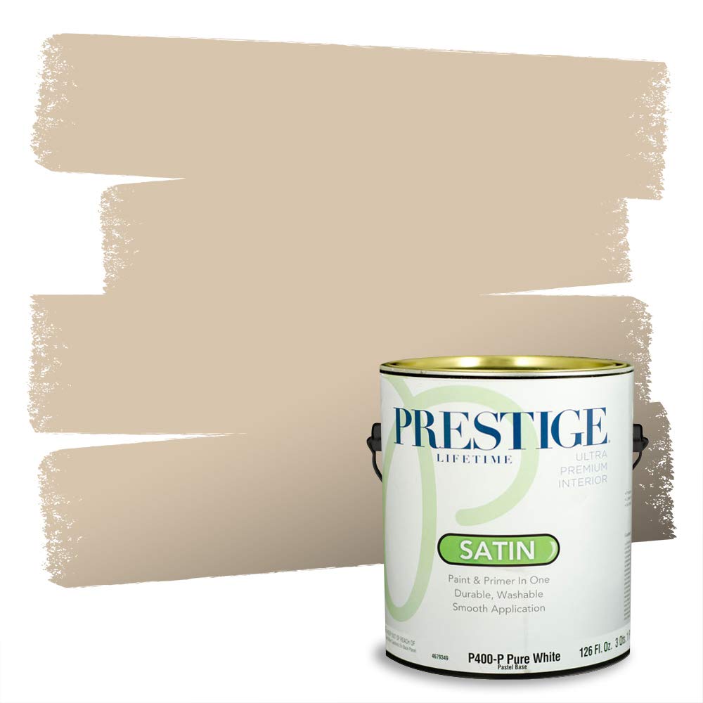
1. PRESTIGE Paints Interior Paint and Primer In One, Satin, Comparable Match of Sherwin Williams Accessible Beige
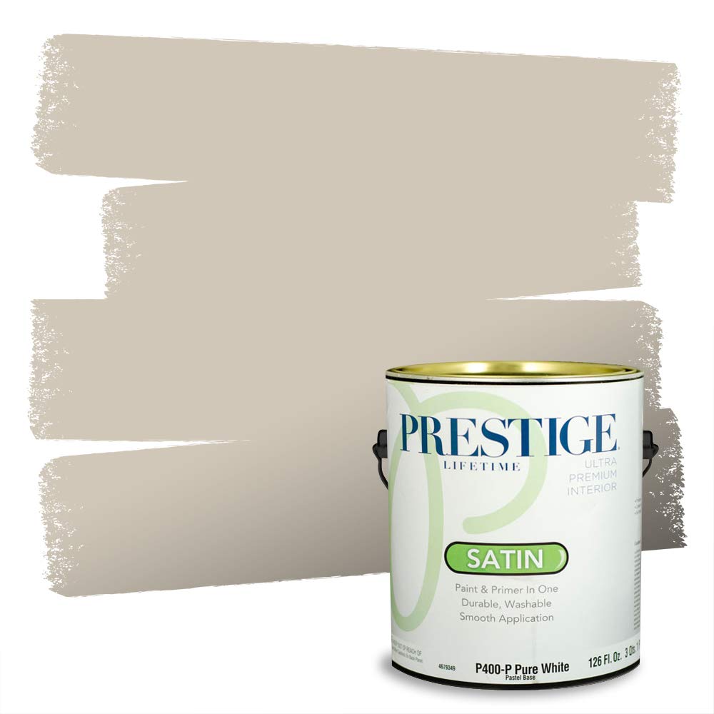
This PRESTIGE satin formula is engineered to be a close comparable match to the popular Sherwin Williams Accessible Beige (SW7036). At 325 square feet of coverage per gallon, it delivers enough paint for a standard bedroom or medium living room. The 100% acrylic latex base provides a smooth application with good adhesion to drywall, plaster, and previously painted surfaces, and the low-VOC formulation stays at under 5 g/L prior to tinting.
Customers report that this paint covers a previous darker color in two coats with excellent hiding power. The satin sheen offers a gentle luster that works well in living rooms, bedrooms, and hallways, balancing cleanability with a soft visual finish. The included can opener and stir stick add convenience for immediate use.
Some users noted a slight pink undertone in specific lighting conditions, which is a common challenge with beige paints. The color code #D0C7B8 reveals a balanced warm-neutral base, but testing a sample patch is recommended before committing to a full room. Overall, this remains the most direct and affordable option for replicating the classic Accessible Beige look.
Why it’s great
- Direct color match to SW Accessible Beige
- One-coat coverage on similar colors reported
- Low VOC and easy soap-and-water cleanup
Good to know
- Pink undertone visible in some lighting
- Not an exact Sherwin Williams licensed formula
2. PRESTIGE Paints Interior Paint and Primer In One, Semi-Gloss, Comparable Match of Sherwin Williams Softer Tan

This satin-to-semi-gloss option from PRESTIGE offers a durable, washable finish that resists moisture and daily wear, making it a strong contender for kitchens, bathrooms, and trim work. The 100% acrylic latex formula provides a thick, creamy consistency that users compare favorably to big-name brands. The semi-gloss sheen reflects more light than satin, so careful wall prep is required to avoid telegraphing imperfections.
Buyers report that this paint blended seamlessly with existing nine-year-old Sherwin Williams flat walls, with one user noting the color match was “flawless.” The coverage range of 250–400 square feet per gallon is realistic depending on surface texture and color contrast. The packaging includes a can opener and stir stick, and the metal locking ring prevents leaks during shipping.
The color code #DACAB1 yields a warm tan-beige that works as a neutral backdrop without reading as overly yellow. The semi-gloss finish is notably more scrubbable than eggshell or flat, which is a genuine advantage in high-touch areas. However, the high sheen may not suit large wall expanses where a softer, more forgiving look is desired.
Why it’s great
- Flawless color match to SW Softer Tan reported
- Thick, high-pigment formula for one-coat coverage
- Moisture and stain resistant for high-traffic areas
Good to know
- Semi-gloss highlights wall imperfections
- Lighter than swatch image for some buyers
3. PRESTIGE Paints Interior Paint and Primer In One, Eggshell, Comparable Match of Benjamin Moore Shaker Beige

This eggshell finish is targeted at those who want a subtle sheen that sits between flat and satin. The Shaker Beige comparable match (HC-45BM-PCM) leans toward a clean, warm neutral that pairs well with grayish tones, offering a “greige” bridge that satisfies both warm and cool decor preferences. The 100% acrylic latex base delivers good flow and leveling for a professional-looking rolled finish.
Users consistently mention the paint’s thick, creamy consistency that spreads like “soft butter” and covers in one coat over lighter shades. The eggshell sheen hides minor surface imperfections better than satin while remaining washable enough for family rooms. The low-VOC formulation (under 5 g/L) keeps indoor air quality in good shape during and after application.
Some customers observed that the color can read as a “gray purple” depending on surrounding decor, which aligns with the neutral greige character of this shade. For those seeking a pure beige without any gray or purple influence, this may not be the ideal pick. The eggshell finish is a solid middle ground for living rooms and bedrooms where durability and softness are both priorities.
Why it’s great
- One-coat coverage on lighter walls reported
- Thick, smooth application like premium brands
- Hides imperfections better than satin
Good to know
- Undertone can shift gray-purple in some rooms
- Not a pure beige — leans greige
4. PRESTIGE Paints Interior Paint and Primer In One, Flat, Comparable Match of Benjamin Moore Sheraton Beige
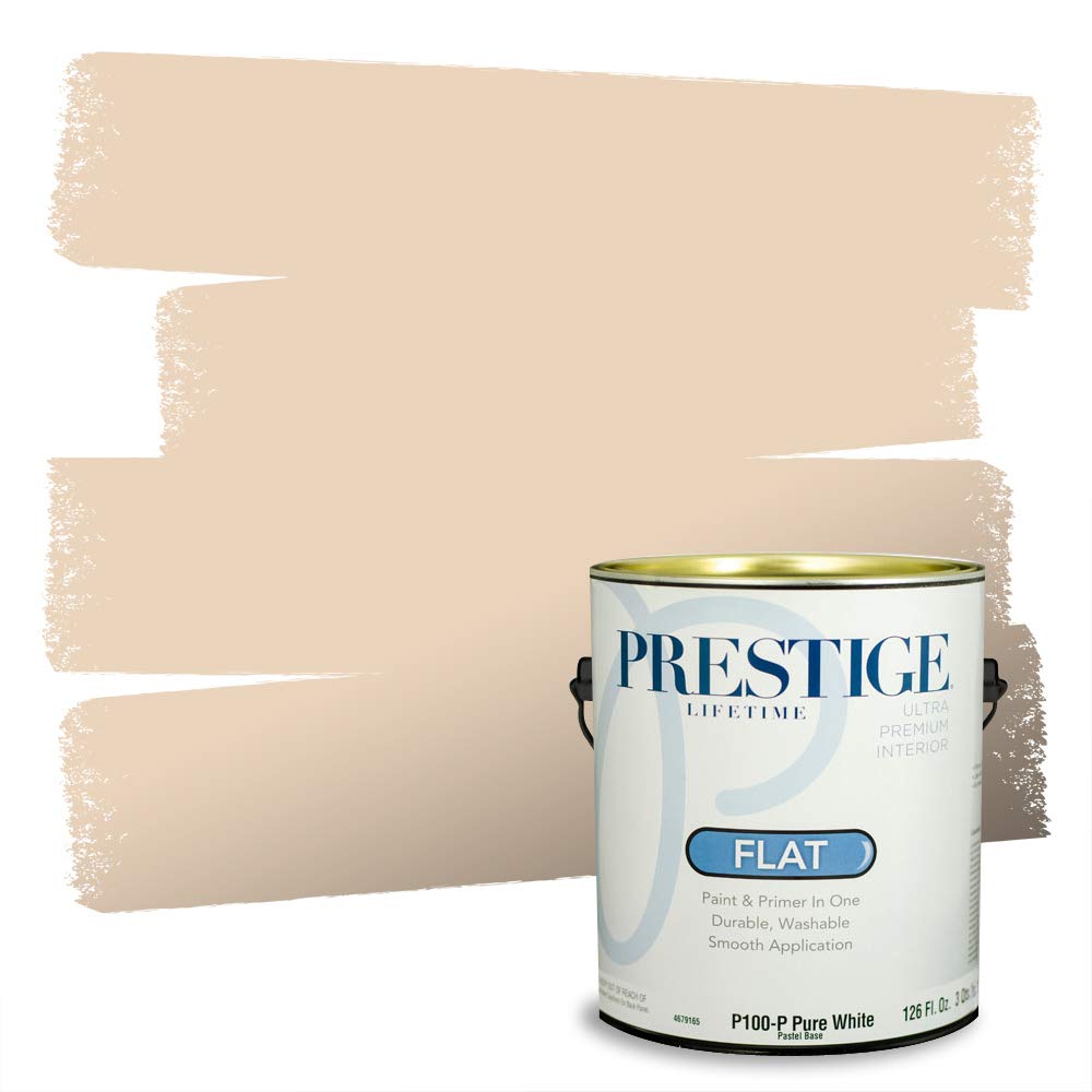
A flat finish is the gold standard for hiding drywall patches, textured surfaces, and minor wall defects. This PRESTIGE satin-to-flat formula (color code #EAD4BC) offers a Sheraton Beige comparable match from Benjamin Moore, providing a warm, creamy beige that doesn’t read as stark or cold. The 100% acrylic latex formulation ensures good adhesion and a uniform flat appearance across the wall.
Users report that this paint goes on smoothly and dries to a beautiful, bright neutral that pulls in beige tones without looking yellow. The flat sheen is ideal for ceilings and adult bedrooms where light reflection is minimal and washability is less of a concern. The four-hour full cure time allows for a second coat within a reasonable window.
The flat finish is less scrubbable than eggshell or satin, meaning scuffs and marks will be harder to clean without leaving a sheen patch. This paint is best suited for lower-traffic areas where the visual benefit of a flat surface outweighs the need for frequent cleaning. The color code #EAD4BC is among the warmer beige options in the PRESTIGE lineup.
Why it’s great
- Excellent at hiding wall imperfections and texture
- Warm beige without yellow or pink undertone
- Smooth application with good one-coat coverage
Good to know
- Flat finish is hard to clean without damage
- Not suitable for high-moisture areas
5. PRESTIGE Paints Interior Paint and Primer In One, Satin, Comparable Match of Sherwin Williams Kilim Beige
This satin finish paint is formulated to match Sherwin Williams Kilim Beige (SW6106), a warm, earthy beige that works well in large open-concept spaces. The color code #D7C5AD produces a balanced tan-beige that pairs nicely with dark wood furniture and warm-toned flooring. The 100% acrylic latex paint provides good coverage at 325 square feet per gallon.
Customers praise the packaging quality, noting PRESTIGE’s metal locking ring and sturdy cans prevent leaks during shipping. The paint itself is described as creamy and thick, providing a smooth finish that looks professional even with a roller. The satin sheen offers a good balance of cleanability and softness for living rooms and family rooms.
A significant minority of users report that this paint does not match the true Kilim Beige color, describing it as lighter or different in undertone. For touch-up work on existing Kilim Beige walls, this is a risky option unless you’re painting the entire wall. For fresh projects, the color is pleasant and warm, but don’t rely on it for spot repairs on Sherwin Williams paint.
Why it’s great
- Best-in-class packaging prevents leaks and damage
- Thick, creamy application with smooth finish
- Warm beige tone complements wood and earth tones
Good to know
- Color match to Kilim Beige is inconsistent
- Not recommended for touch-ups on SW paint
6. PRESTIGE Paints Interior Paint and Primer In One, Semi-Gloss, Comparable Match of Valspar Cream in my Coffee

This semi-gloss option from PRESTIGE targets high-humidity and high-traffic areas like kitchens, bathrooms, and laundry rooms. The Cream in my Coffee comparable match offers a warm, slightly creamy beige that adds brightness to smaller spaces. The 100% acrylic latex formula includes fade, stain, and UV resistance, making it a durable choice for rooms that see direct sunlight or heavy use.
Regular buyers of the PRESTIGE brand report purchasing this paint multiple times for interior repaints, citing true color representation and smooth application. The semi-gloss sheen cleans up easily with just soap and water, and the low-VOC composition keeps the room usable sooner. The paint covers dark paneling in one coat according to some users, though two coats are typical for full coverage.
The semi-gloss finish is the most reflective option in this lineup, so it will reveal every roller lap and wall imperfection. This paint is best for trim, cabinetry, and small accent walls rather than large wall expanses. The Cream in my Coffee shade is warmer than Accessible Beige, with more yellow undertone, which may clash with cool-toned decor.
Why it’s great
- Moisture and UV resistant for tough rooms
- Excellent coverage on dark surfaces reported
- Low VOC with easy cleanup
Good to know
- Semi-gloss shows every wall imperfection
- Warmer/yellower than true beige options
7. Lukas CRYL Studio Artist Acrylic Paint, Beige, 250 ml Bottle
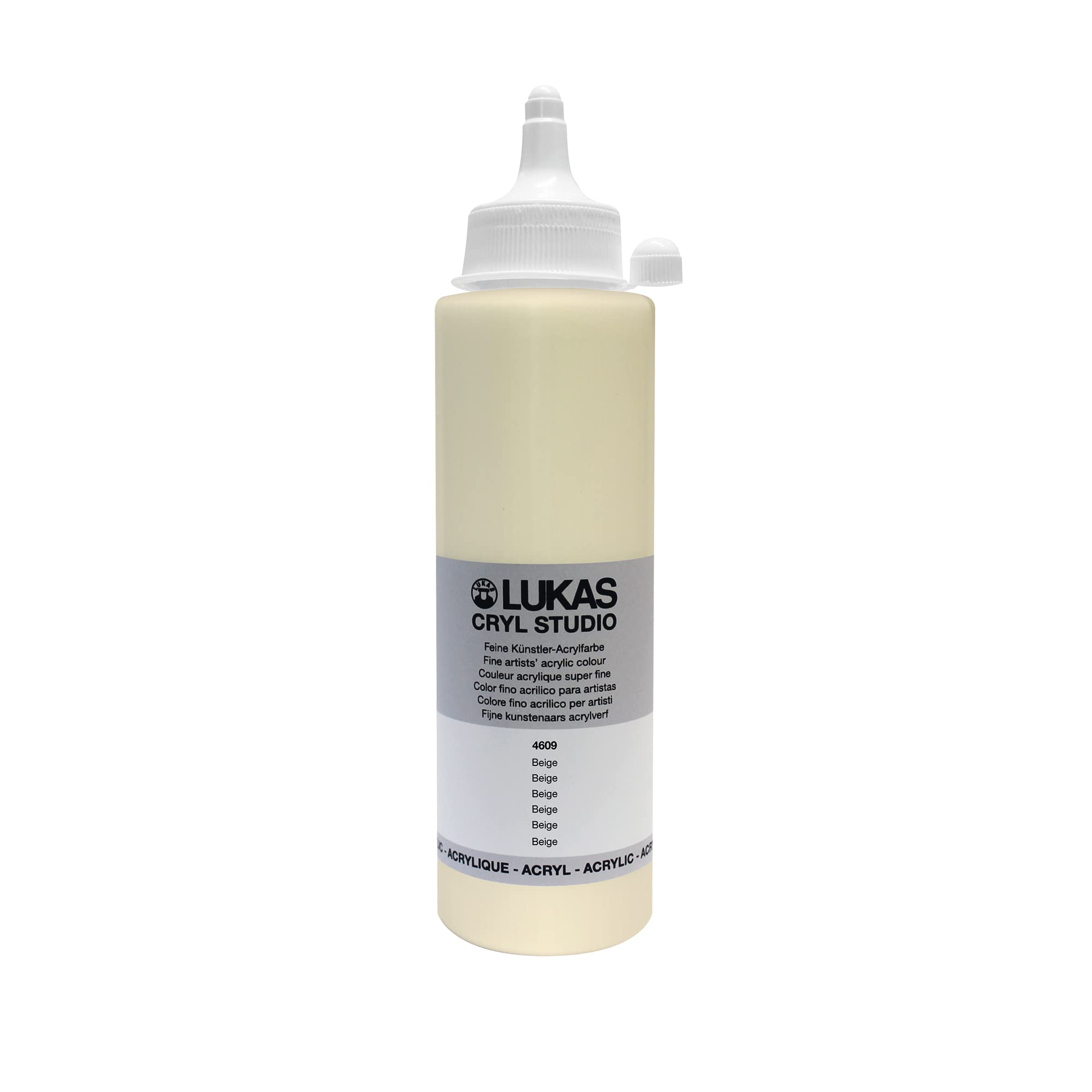
This is not a wall paint — it’s a high-pigment artist-grade acrylic from Lukas, a German brand known for reliable binder quality and colorfast pigments. The satin finish and medium-viscosity formula are designed for canvas, large-scale works, and mixed-media projects rather than home interior walls. At 250 ml per bottle, it’s intended for studio use, not room coverage.
Artists consistently rate Lukas paint above cheaper student-grade brands, noting that the high pigment concentration uses less paint per project and mixes true to color without the muddying common in budget acrylics. The binder holds pigment evenly across large washes, making it suitable for mural work and wet-on-wet techniques. The beige color is a clean, neutral tone that works as a base or mixer for flesh tones and landscapes.
This product is included for buyers who need beige acrylic paint for art projects, not for wall painting. The 250 ml bottle is small, and the price per volume is high compared to house paint. If you’re painting a wall, choose one of the interior paints above. If you’re creating artwork, this Lukas paint delivers professional-grade pigment and binder consistency.
Why it’s great
- High pigment concentration for true color
- Superior binder quality, no cracking or shrinking
- Ideal for large-scale studio work and murals
Good to know
- Not suitable for interior wall painting
- Small 250 ml bottle — high cost per volume
FAQ
Is Accessible Beige paint the same as Agreeable Gray?
Can I use a budget-friendly beige paint for color matching an expensive brand?
What sheen should I choose for a beige living room with south-facing windows?
Final Thoughts: The Verdict
For most users, the accessible beige paint winner is the PRESTIGE Satin Accessible Beige because it offers the most direct and affordable path to the classic SW7036 look with solid coverage and a clean satin finish. If you want a more durable, semi-gloss finish for high-traffic zones, grab the PRESTIGE Softer Tan Semi-Gloss. And for a softer, imperfection-hiding finish in low-traffic rooms, nothing beats the PRESTIGE Sheraton Beige Flat.