An art book that only looks pretty on a coffee table is a missed opportunity. The real magic happens when heavy pages hold masterworks you can study, reference images that shift your perspective, or technical breakdowns that finally make color theory click. Whether you are building a personal library, hunting for reference material, or hunting for a gift that says something meaningful, the difference between a decorative object and an educational cornerstone comes down to the same thing: what you actually do with it.
I’m Min — the co-founder and writer behind Gadgets Feed. I spend my days scouring publisher catalogs, comparing print quality across editions, and analyzing how layout, paper stock, and binding affect the real-world usefulness of visual reference books.
This guide cuts through the shelf appeal to find the volumes that pull you back again and again. After evaluating dozens of titles across price tiers and formats, these are the standout selections for anyone hunting for meaningful art with books that delivers genuine long-term value.
How To Choose The Best Art With Books
Every art book serves a different purpose, and the best choice depends entirely on whether you are studying, admiring, or gifting. The three factors that separate a lifelong resource from a once-flipped-through decoration are print reproduction quality, instructional depth, and physical handling.
Instructional vs. Curatorial Intent
A techniques book like Art Fundamentals or Anatomy for Artists uses text-heavy layouts and annotated diagrams to teach measurable skills. A curatorial volume like Vatican: All the Paintings or Hayao Miyazaki prioritizes high-resolution plates and scholarly context over step-by-step instruction. Know which outcome you need before you buy — the binding, paper weight, and page dimensions differ significantly between the two categories.
Print Reproduction and Paper Quality
Coated, acid-free paper with a matte or semi-gloss finish preserves fine details and color accuracy far better than uncoated stock. Books over 3 pounds (like the Vanity Fair compendium or the Vatican collection) typically use thicker paper and sewn bindings that lie flatter for easier viewing. Mid-range guides under 2.5 pounds often rely on glued spines that can crack under heavy use.
Dimensions and Portability
A 9 x 12 inch format offers the best balance for studying details without requiring a dedicated reading table. Oversized volumes at 11 x 14 inches (such as the Vanity Fair edition) command attention on a coffee table but are unwieldy for travel or casual flipping. Pocket-sized field guides sacrifice plate size for portability — avoid them for anything requiring close visual study.
Quick Comparison
On smaller screens, swipe sideways to see the full table.
| Model | Category | Best For | Key Spec | Amazon |
|---|---|---|---|---|
| Anatomy for Artists | Instructional | Figure drawing practice | 304 pages, 3.38 lb | Amazon |
| Artists’ Master Series: Color and Light | Instructional | Color theory mastery | 388 pages, 4.0 lb | Amazon |
| Art Fundamentals 2nd edition | Instructional | Foundation skill building | 288 pages, 2.8 lb | Amazon |
| Hayao Miyazaki | Monograph | Studio Ghibli fans | 288 pages, 2.31 lb | Amazon |
| Andy Warhol. Polaroids | Monograph | Coffee table display | 408 pages, 2.31 lb | Amazon |
| Vatican: All the Paintings | Reference | Art history reference | 542 pages, 8.36 lb | Amazon |
| Vanity Fair 100 Years | Reference | Photography & culture | 456 pages, 8.44 lb | Amazon |
In‑Depth Reviews
1. Anatomy for Artists: Drawing Form & Pose

Tom Fox’s drawing manual stands apart by treating anatomy as a building-block system rather than a set of reference photos. The 304-page progression starts with simple stick-like shapes and gradually layers in bone landmarks, muscle groups, and foreshortened poses — a structure that prevents the overwhelm common in classic but dense texts like Bridgman. Experienced artists report uncovering new pointers even after decades of figure drawing.
The physical book measures 9.5 x 11.5 inches, giving each diagram room to breathe without requiring a dedicated studio table. The 3.38-pound weight signals robust paper stock that holds up to repeated flipping, and the spine is sewn rather than glued, so it lies reasonably flat for hands-free reference while you work. Daily practice sessions of 15 to 60 minutes over three months have yielded measurable improvement in figure proportions and dynamic posing.
One limitation: the book does not cover gesture drawing explicitly, so beginners should layer a gesture practice on top of the anatomical progression. The recommended reading order matters — jumping between chapters undermines the cumulative learning design. For anyone serious about drawing the human figure from imagination, this is the single best investment in the list.
Why it’s great
- Systematic build from simple shapes to complex anatomy reduces overwhelm
- Sewn binding and sturdy paper hold up under heavy studio use
- Effective for both absolute beginners and experienced artists seeking refinement
Good to know
- No dedicated gesture drawing section
- Best results come from following chapters in strict order
2. Artists’ Master Series: Color and Light

This is volume lives in the rare space between coffee-table beauty and genuine instruction. At 388 pages and 4 pounds, it covers color theory, lighting, shading, backgrounds, focal simplification, and material rendering with a text-heavy approach that rewards slow, deliberate reading. The 8.5 x 12 inch format gives full-bleed reproductions room to illustrate subtle edge-light shifts and atmospheric perspective.
What makes it stand out from other color reference books (including Gurney’s Color and Light and Yot’s Light for Visual Artists) is the organizational clarity. Each chapter ends with a tutorial section that walks through a finished piece from start to finish, showing exactly how the theoretical concepts translate into mark-making decisions. Beginners can follow the step-by-step projects, while advanced artists will find fresh insights in the material-specific breakdowns for metal, glass, fabric, and skin.
The main trade-off is the weight. At 4 pounds, this is not a book you toss in a bag for cafe sketching. The paper is thick enough to support water-based media swatching on the margins without bleed-through, but the glued spine may crack if you force it flat on a crowded desk. A dedicated reading stand solves both issues. For anyone struggling to understand why their digital or traditional paintings feel flat, this is the corrective.
Why it’s great
- Text-heavy, concept-driven instruction that rewards re-reading
- Tutorial projects bridge theory into practical application
- Superior organization compared to other color-and-light reference books
Good to know
- Heavy at 4 pounds; awkward for travel or casual flipping
- Glued binding may not survive aggressive flattening
3. Art Fundamentals 2nd edition

The 2nd edition of Art Fundamentals covers the six pillars — light, shape, color, perspective, depth, and composition — plus an anatomy chapter, in a clean 8.2 x 11.6 inch format. At 288 pages and 2.8 pounds, it is the lightest instructional book in this review, making it genuinely portable for study groups or library reading sessions. The annotated layout uses sidebars and arrows to call out compositional decisions directly on finished artwork, which is far more intuitive than dry diagram-only textbooks.
Each chapter dedicates serious space to “value” — the tonal range between pure black and pure white — a topic many beginner guides gloss over. The annotated edition also includes expanded sidebars with practical tips for digital and traditional mediums, so the lessons apply whether you work in oils, charcoal, or a tablet. Reviewers consistently note that the book works as a springboard for further study rather than a one-and-done read.
Shipping fragility is the common complaint. The soft-cover edition arrives in simple envelopes and can suffer crushed corners or spine damage during transit. If you can, order a hardcover or request expedited packaging. The content itself is a near-perfect launch pad for new artists who feel overwhelmed by the depth of Color and Light or Anatomy for Artists.
Why it’s great
- Exceptional chapter on tonal value rarely covered in beginner books
- Clean, annotated diagrams work for both digital and traditional artists
- Lightweight and portable compared to other instructional tomes
Good to know
- Soft cover is prone to shipping damage
- Less depth than the Master Series for advanced students
4. Hayao Miyazaki

Published by DelMonico Books as a companion to the 2021 Academy Museum exhibition, this monograph reproduces Miyazaki’s original pencil and watercolor concept art alongside background paintings from his filmography. The 9 x 10.75 inch trim size keeps the focus on full-page reproductions rather than overcrowded layouts, and the 288 pages include essays by film scholars that contextualize his creative process, recurring themes, and symbolic storytelling.
The quality of the paper and printing matter here because Miyazaki’s watercolor washes and pencil line weights are subtle. Low-quality stock would muddy the transparent layers of Spirited Away backgrounds or the fine hatching in Nausicaä storyboards. This edition handles those details cleanly, and the matte finish prevents glare during reading sessions under natural light. A filmography appendix indexes every major work with production notes.
This is not an instructional book. It offers no step-by-step drawing lessons or color theory breakdowns. It is a scholarly-artistic survey designed for Ghibli devotees and animation students studying composition and world-building. At 2.31 pounds, it is light enough to display on a shelf or coffee table without dominating the space, but substantial enough to feel like a proper reference volume.
Why it’s great
- Exceptional reproduction of Miyazaki’s watercolor and pencil originals
- Scholarly essays add context beyond a simple image collection
- Matte paper eliminates glare; ideal for study under natural light
Good to know
- No instructional or how-to content
- Pencil line weights require high-resolution printing; budget editions lose detail
5. Andy Warhol. Polaroids
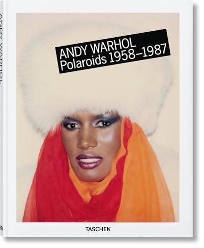
TASCHEN’s multilingual edition collects Warhol’s spontaneous Polaroid portraits of celebrities, friends, and everyday objects across 408 pages. The 8.66 x 11.02 inch format is compact enough for a small side table but expands into generous full-bleed spreads when opened. The print quality is exceptional — the rich saturation of the dye-transfer prints and the raw immediacy of Warhol’s snapshots come through without the overly processed look that cheap photo books suffer from.
The text runs in English, German, and French, opening the book to a wider audience without feeling cluttered. The multilingual layout uses a clean three-column system that keeps each language readable without crowding the images. For Warhol fans and photography buffs, this is a goldmine of reference material — the way he crops, frames, and lights casual subjects reveals compositional instincts that are harder to study from his more polished silkscreen series.
The paperback cover and moderate weight (2.31 pounds) make it an excellent gift option or a low-commitment way to add serious photography art to a home library. The only missing piece is deep contextual commentary — this is a visual catalog first, with captions limited to subjects and dates. If you want scholarly analysis of the Factory era alongside the images, you will need a companion volume.
Why it’s great
- Vibrant color reproduction preserves Polaroid dye-transfer quality
- Compact trim size fits on smaller shelves and side tables
- Multilingual text opens it to global art lovers
Good to know
- Limited to captions; minimal scholarly or biographical commentary
- Paperback cover may show wear with heavy shelf use
6. Vatican: All the Paintings
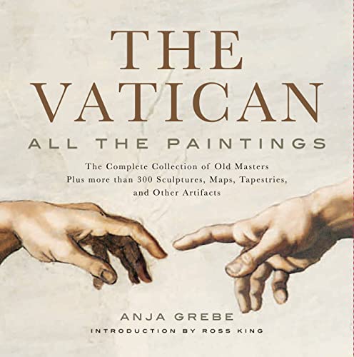
At 542 pages and 8.36 pounds, this volume is the heaviest single title in the roundup — and it earns every ounce. Published by Black Dog & Leventhal, it catalogs the complete collection of Old Masters in the Vatican Museums plus over 300 sculptures, maps, tapestries, and other artifacts. The 11.25 x 11.6 inch dimensions give Caravaggio’s chiaroscuro and Raphael’s fresco studies room to command attention without cramping details into gutters.
What justifies the investment is the research density. Each piece includes a reproduction alongside a well-researched commentary on iconography, provenance, and artistic technique. The arrangement follows the museum’s layout rather than strict chronology, which mimics the experience of walking the galleries. Reviewers who have visited the Vatican confirm that the book fills in the overwhelmed gaps — you see details you missed in person and learn context the on-site plaques skip.
The sheer bulk limits how and where you use it. This is a tabletop book that lives on a sturdy stand or a dedicated shelf; it will not fit in a standard backpack or on a casual lap-reading session. The sewn binding is robust enough for decades of use, and the slipcase from the publisher protects the corners during storage. For art history students and museum-quality reference needs, nothing else on this list competes.
Why it’s great
- Comprehensive catalog of Vatican art with scholarly commentary
- Museum-layout organization mirrors the gallery experience
- Sewn binding and slipcase offer archival-level protection
Good to know
- Extremely heavy (8.36 lb); requires a sturdy reading surface
- Oversized format is not portable
7. Vanity Fair 100 Years

Harry N. Abrams released this massive illustrated edition to mark Vanity Fair’s centennial, and it operates as both a cultural history of the 20th century and a masterclass in portrait and fashion photography. The 14.25 x 11 inch trim size is the largest in this review, and the 456 pages are packed with editorial and celebrity photography from Annie Leibovitz, Herb Ritts, Helmut Newton, and other lens legends. The matte background with glossy font on the cover gives it the elevated, modern feel that reviewers consistently call “chic and timeless.”
Organizationally, the book sections each decade with introductory essays that contextualize the images within the social and political climate, turning a simple photo collection into a narrative of shifting American culture. The print reproduction handles both high-contrast black-and-white portraiture and saturated color editorial spreads without losing shadow detail or clipping highlights. At 8.44 pounds, it sits definitively in coffee-table territory, but the cultural density makes it a conversation starter rather than a silent decoration.
The main consideration is the sheer physical footprint. At 14.25 inches tall, it will overhang most standard bookshelves. The corners are vulnerable to scuffing during handling, and some early copies shipped with torn front wrapping. The content is irreplaceable for anyone interested in the intersection of photography, celebrity, and 20th-century history, but the format demands a dedicated display space.
Why it’s great
- Curated visual history of 20th-century culture through iconic photography
- Decade-by-decade essays provide rich social context
- Elevated cover design stands out on any table
Good to know
- Oversized format does not fit standard bookshelves
- Heavy and fragile during handling; shipping can cause damage
FAQ
What is the ideal trim size for an instructional art book?
Can I use an art book as a reference for digital painting in programs like Procreate?
How do I tell if an art book uses acid-free archival paper?
Final Thoughts: The Verdict
For most users, the art with books winner is the Anatomy for Artists because its systematic, building-block approach to figure drawing works for every skill level and stays relevant through years of use. If you want deep mastery of color and lighting theory, grab the Artists’ Master Series: Color and Light. And for a visually stunning reference that doubles as a coffee-table piece, nothing beats the Vanity Fair 100 Years.